Understanding Component Properties in Figma
When designing components in Figma, it’s easy to focus on the visual aspects like colors and shapes, but a well-built component requires much more than that. To create scalable and reusable components, it’s essential to define their properties and structure from the start. This means considering size variations, spacing, typography, states, and even how content is arranged within the component.
For example, a button might seem simple, but it includes many properties that influence its usability. How big should the button be? Does it need different sizes for desktop and mobile? What colors will it use for different states like hover and disabled? Should it have a border or shadow? Will it include an icon, and if so, where should it be positioned? Thinking through these details early on helps create a consistent design system that can scale efficiently across different projects.
Content Comes First
Before anything else, content should be the priority when building components. This doesn’t just mean text. It could also be an icon, a loading spinner, or any other visual element that communicates meaning. The component’s structure should be built around its content, ensuring that it remains flexible and adaptable.
For buttons, for instance, the text inside will determine how wide the button should be. If the button is dynamic, meaning its width adjusts based on the text length, then auto layout becomes an essential tool. Auto layout ensures that as content changes, the button’s size adjusts accordingly without breaking the design.
Setting Up Auto Layout and Padding
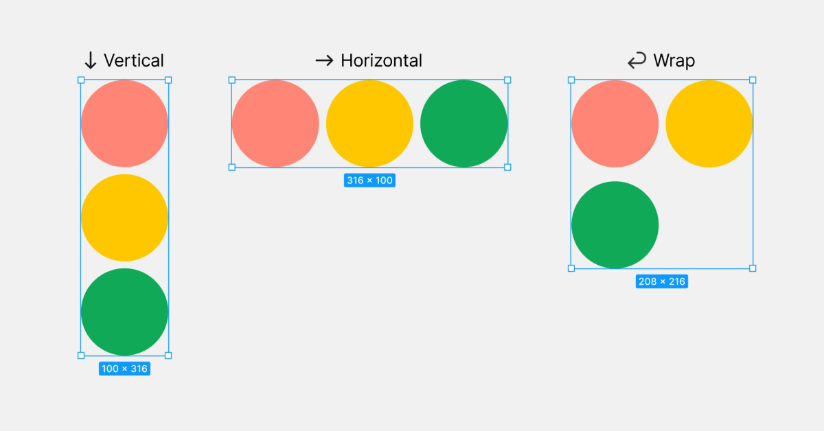
Once the content is in place, the next step is defining auto layout and padding. Using Figma’s auto layout feature makes it easy to control spacing and alignment. Instead of manually adjusting margins and paddings, auto layout ensures consistency across different button sizes.
For example, horizontal padding might be set to 12px and vertical padding to 4px. Instead of inputting these values manually each time, using design variables allows for greater flexibility. By applying pre-defined spacing variables, changes can be made more efficiently without affecting the overall component structure. This is especially useful when updating multiple components at once.
Another key consideration is whether the component should have a fixed width or hug its content. A fixed-width button might be necessary for navigation elements, while a button inside a form might need to expand based on text length. Understanding the use case will help determine the best approach.
Defining Component Styling
With auto layout set up, the next step is styling. This includes setting the button’s shape, border radius, and visual appearance. A button might have sharp corners for a modern look or rounded edges for a softer feel. These design choices should be consistent across all components in the system.
Applying color variables ensures that button states remain visually consistent. For instance, a primary button might have a blue background with white text in its default state. When hovered, the background could shift to a slightly darker blue, and when disabled, it might become gray. Using component-specific tokens for states like default, hover, active, and disabled makes these transitions seamless and easy to manage.
If a button includes an icon, its placement should be considered as well. Should it always appear on the left side of the text? Should users have the option to choose between an icon before or after the text? Setting these rules upfront prevents inconsistencies later on.
Creating Multiple States and Variants
A well-structured component should account for different states. A button isn’t just static. It needs to visually respond to interactions. Common states include default, hover, active, disabled, and sometimes even a loading state.
Building these variations within a component set allows for easy switching between states. For instance, instead of creating separate buttons for each state, a single button component can have built-in states that can be toggled in the properties panel. This keeps the file organized and makes adjustments easier.
When creating component sets, naming conventions are important. If each state isn’t named properly, Figma may not assign them correctly when generating variants. Ensuring that each state has a clear and unique name avoids confusion and helps maintain a structured design system.
Organizing and Documenting Components
Once the component set is complete, adding documentation ensures that other designers and developers can use it correctly. Descriptions can be added within Figma’s component settings to provide guidance on usage, such as when to use a primary button versus a secondary button.
Some teams prefer to keep documentation outside of Figma, using tools like Confluence or Storybook. However, keeping at least a basic description within Figma itself ensures that anyone working directly in the design file can access important details without needing to refer to external documentation.
It’s also helpful to organize components within a dedicated library. Grouping related components together (such as all button variations in one section) makes it easier to find and update them when needed. Maintaining a clean and structured file helps teams collaborate more efficiently.
Final Thought
Taking the time to properly structure components in Figma leads to a smoother design process and a more maintainable design system. Whether working on a button, an input field, or a more complex component, following these steps ensures consistency and scalability. If you’d like to discuss this topic further or explore how I can help you build one for your project or your team, feel free to reach out at hello@anitachang.com. I’d love to hear from you!
