Understanding Component Properties in Figma
One of the best parts of using Figma for design systems is how easily components can be customized without having to rebuild them from scratch. Component properties help make this possible, allowing designers and developers to tweak elements like size, color, text, and even interactivity. These properties make a component dynamic, reusable, and adaptable for different use cases.
At first, component properties were limited to basic variants, but Figma has expanded its capabilities significantly. Now, in addition to variants, we can use boolean properties, instance swaps, and text properties to make components even more powerful. Each component can have a unique combination of these properties depending on its purpose. There’s no single right way to set them up. It all depends on how you want your components to function within your design system.
Adding Properties to Component Sets
When setting up component sets, properties should be added progressively. Instead of defining everything upfront, it’s often more efficient to build a basic structure and then add properties as needed. For example, a simple button component might start with just a few states like default, hover, and disabled. But as the design system evolves, more properties can be introduced (such as size variations, color themes, or icon toggles) without disrupting the existing setup.
By layering properties on top of each other, components become more versatile. A single button component, for instance, can have multiple states, different sizes, and optional icons. This eliminates the need to create separate button components for each variation, keeping the design system clean and efficient.
Defining Key Component Properties
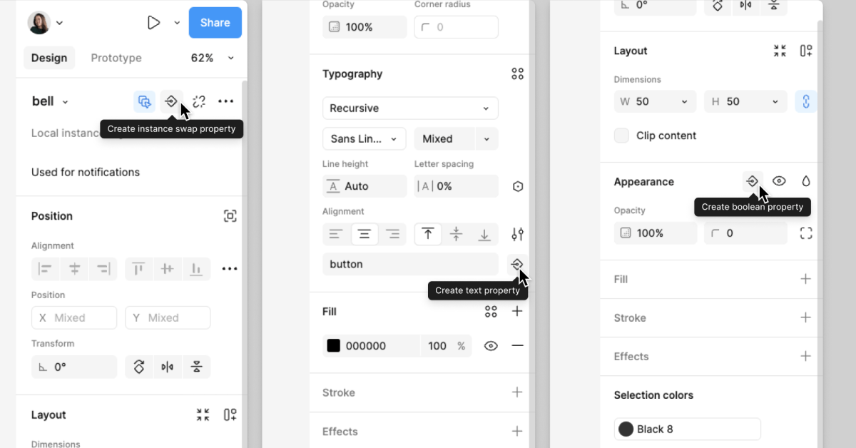
Figma provides several property types that help structure components in a flexible way. The most commonly used ones include:
Variants: Variants allow designers to group multiple versions of a component into one unit. This is typically used for states like default, hover, and active. Instead of having separate buttons for each state, a single button component can contain all these variations within a variant property, making it easy to switch between them.
Boolean Properties: Boolean properties act as simple on/off switches, making it easy to toggle specific elements inside a component. For example, a button might have a leading icon that can be turned on or off depending on whether it’s needed. This is useful for keeping components lightweight while still allowing customization.
Instance Swap: This property is particularly helpful when working with nested components. It allows designers to swap out one component for another within a larger component. For example, in a button component, an icon can be swapped without changing the structure of the button itself. This makes it easy to replace icons while maintaining a consistent layout.
Text Properties: The text property allows text inside a component to be edited directly from the properties panel, without having to drill into the component. This is especially useful for things like buttons or input fields where the label might change frequently. By using a text property, designers can update button labels without modifying the component structure.
Building a More Advanced Component Set
Once the basics are in place, more advanced properties can be introduced to refine the component set. For example, when working with buttons, adding both variant and size properties can make the component even more adaptable. A button might have a primary and secondary variant, as well as small, medium, and large size options. By assigning these properties within Figma’s property panel, users can switch between them easily without creating multiple separate components.
Another example is incorporating multiple boolean properties. If a button component includes both a leading and trailing icon, separate boolean properties can be used to toggle each one on or off. This way, designers can control the presence of icons dynamically, ensuring the button can be customized for different scenarios without duplicating components.
When working with instance swaps, it’s important to ensure that the components being swapped are properly structured. For example, if a button includes a nested icon, that icon should be set up as a separate component so it can be easily swapped with other icons. This makes it possible to replace one icon with another while keeping the button’s design intact.
Organizing Properties for Better Usability
As more properties are added, keeping them organized becomes important. When viewing the properties panel, having a logical order makes it easier to understand and use the component effectively. For example, related properties should be grouped together such as placing the leading icon toggle next to the leading icon swap option. This helps users quickly find and adjust the settings they need without confusion.
Another useful practice is adding clear descriptions and documentation within the component properties. This can include details on when to use each property, what values are available, and any special considerations for developers. Keeping this information accessible ensures that the component can be used correctly by everyone on the team.
Final Thought
Component properties make Figma’s design system workflow more efficient by allowing for structured, reusable, and highly customizable components. By leveraging variants, boolean toggles, instance swaps, and text properties, designers can create flexible components that adapt to different needs without unnecessary duplication. If you’d like to discuss this topic further or explore how I can help you build one for your project or your team, feel free to reach out at hello@anitachang.com. I’d love to hear from you!
