Understanding Button Variants in a Design System
Buttons are one of the most fundamental components in any interface. They guide users, trigger actions, and help create a seamless experience. But not all buttons serve the same purpose, which is why defining different button variants is so important.
We explored how to create button variants, focusing on their sizes, types, and styles. Instead of approaching each button as a separate component, we learned how to structure them into a flexible system using Figma’s component properties. By the end of the session, we had a clear understanding of how to build scalable button components that are easy to maintain and adjust across different projects.
Defining Button Sizes
The size of a button plays a big role in usability. A button that’s too small can be difficult to tap, especially on mobile, while an oversized button can feel out of place in certain layouts. To keep things simple and scalable, we defined three standard button sizes:
- Small: Compact and space-efficient, perfect for toolbars, secondary actions, or navigation menus.
- Medium: The most common size, used in forms, modals, and content-heavy layouts.
- Large: Designed for high-visibility call-to-action (CTA) buttons, often found on landing pages or key conversion points.
Some design systems may also include extra-small or extra-large buttons for specific use cases, but the key takeaway is consistency. Using standardized size variables like sm, md, and lg ensures that buttons remain uniform across different screens and devices.
Structuring Button Variants
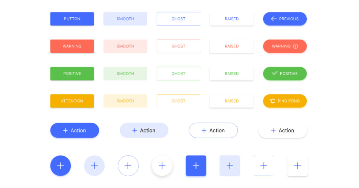
Beyond size, button variants help define the role each button plays in an interface. A primary button should stand out, a secondary button should complement it, and a tertiary button should be more subtle. These distinctions ensure a clear visual hierarchy.
- Primary Button: The main call-to-action (e.g., “Sign Up” or “Buy Now”). It’s visually dominant and should be used sparingly to maintain emphasis.
- Secondary Button: A supporting action that’s less prominent than the primary button (e.g., “Learn More” or “Cancel”). It provides an alternative without competing for attention.
- Tertiary Button: A lower-priority action, usually styled as text with no background (e.g., “Forgot Password?”). It’s useful for links that don’t require immediate attention.
- Outlined Button: A button with just a border, offering a lightweight alternative to filled buttons while still maintaining a clickable look.
- Ghost Button: A very subtle button, often used on colored backgrounds where a stronger button style would be too overwhelming.
- Destructive Button: Designed for irreversible actions like deleting an account. These buttons are often red or styled to warn users before proceeding.
- Icon Button: A button without text, using just an icon (e.g., a search magnifying glass or a close “X”). These are useful for compact interfaces.
- Disabled Button: A grayed-out button that prevents interaction, signaling that an action isn’t available yet.
- Full-Width Button: Stretches to fill the container, commonly used for mobile designs or bold CTAs.
Each variant serves a different function, but the key is making sure they are easy to recognize and intuitive for users.
Applying Figma’s Component Properties
One of the most useful takeaways from this class was learning how to apply Figma’s component properties to button variants. Instead of creating separate components for each variation, we learned how to consolidate everything into a single component set.
We started by defining a size property, allowing us to toggle between small, medium, and large buttons. Then, we added a variant property, which defined whether the button was primary, secondary, or another type. This made switching between different styles effortless.
Boolean properties also played a big role. By adding a boolean toggle, we were able to turn icons on and off within the button component. This means that rather than creating separate button components for “with icon” and “without icon,” we could simply toggle the icon visibility.
For instance swaps, we nested icon components inside the button, allowing us to replace icons without affecting the button structure. This made it incredibly easy to swap out different icons while keeping everything aligned with the design system.
Creating a Complete Button Set
Once we had the foundation in place, we moved on to adding additional button types, including secondary and destructive buttons. This involved adjusting colors, borders, and states using component-specific variables.
One of the most interesting challenges was ensuring that button colors followed a logical structure. By linking each button variant to predefined color tokens, we maintained consistency across different states (default, hover, active, disabled).
For example, we applied:
- Default state colors: Background, border, and text colors set according to the button type.
- Hover state colors: A slightly darker shade for better visual feedback.
- Active state colors: A pressed effect that makes interactions feel responsive.
- Disabled state colors: Lower contrast to indicate that the button is inactive.
By working through these steps, we built a button set that could adapt to different styles and layouts without needing to manually recreate buttons each time.
Final Thought
This session reinforced the importance of designing with scalability in mind. Rather than building buttons as one-off components, structuring them with thoughtful properties and variants ensures flexibility while keeping the design system clean. By leveraging Figma’s component properties like variants, booleans, and instance swaps, we can create buttons that are not only visually consistent but also easy to maintain.
If you’d like to discuss this topic further or explore how I can help you build one for your project or your team, feel free to reach out at hello@anitachang.com. I’d love to hear from you!
