
Why a Strong Foundation Matters
When creating a design system, the first step is to establish a strong foundation. These foundational elements serve as the building blocks for everything else such as components, interactions, and patterns. A well-defined foundation ensures consistency, scalability, and efficiency across a product, helping teams maintain a unified experience.
Think of it like constructing a house. Before adding furniture and decor, you need a solid structure such as walls, floors, and a stable frame. In design, this translates to defining colors, typography, spacing, and other key elements that will shape the entire system. Without a solid foundation, designs can quickly become inconsistent and difficult to manage.
Key Foundations in a Design System
A design system’s foundation is made up of several core elements, each playing a crucial role in shaping the product’s overall look and feel. These include color, typography, spacing, icons, and branding. Establishing these elements first ensures a cohesive and well-organized system that designers and developers can rely on.
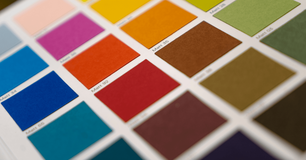
Color System
Color is one of the most important aspects of a design system. It influences branding, accessibility, and usability. A well-defined color system includes primary, secondary, and neutral colors, each with a specific role. Colors are used for backgrounds, text, borders, buttons, and alerts. Ensuring that all colors meet accessibility guidelines, such as WCAG contrast standards, helps improve readability and makes the interface more inclusive. Since color is applied to almost every element in an interface, it is one of the first things to establish when building a design system.
Typography
Text is essential for communication, so a clear and structured typography system is necessary. Defining font families, sizes, weights, and line heights ensures that text remains readable and visually appealing across different screens and devices. Establishing guidelines for where and how to use headings, body text, captions, and links helps maintain consistency. Accessibility considerations, such as minimum text sizes and sufficient contrast, also play a role in ensuring an inclusive design. A well-planned typography system supports hierarchy and guides users effectively through content.
Spacing: Margin & Padding
Spacing helps define structure and readability in a design system. Margin controls the space between different elements, ensuring layouts feel open and uncluttered. Padding, on the other hand, creates internal spacing within components, such as the space inside a button or card. Using a structured approach like the 4-point grid system (e.g., increments of 4px, 8px, 16px) ensures uniformity and balance across the interface. Without a consistent spacing system, designs can feel uneven, making interfaces harder to navigate.
Radius: Defining Shape
The shape of elements, such as buttons and cards, is defined by their border radius. Some designs favor sharp corners for a structured and modern look, while others use rounded edges for a softer feel. Having a set of predefined radius values in a design system ensures that all UI components follow a consistent shape language, preventing inconsistencies where some elements appear rounded while others remain sharp.
Icons: Supporting Visual Communication
Icons act as visual shortcuts, helping users understand functionality at a glance. A design system should include a standardized icon library that aligns with the overall design style. Icons should have consistent stroke weights, sizes, and grid alignment to ensure they fit seamlessly into different UI elements. Additionally, providing clear usage guidelines prevents confusion about when and where to use icons effectively. Icons may seem like small details, but they play an important role in improving usability and visual hierarchy.
Photography & Imagery
While not every design system includes photography, defining clear guidelines for image usage can help maintain a cohesive brand identity. This includes specifying image quality, composition, lighting, and color grading. Establishing principles for when and where to use photography, such as hero images or backgrounds, ensures that visuals align with the overall product aesthetic. Accessibility considerations, such as adding alt text for screen readers, should also be included to make images more inclusive.
Logo & Branding
A company’s logo is a key part of its identity and should be documented within the design system. This includes logo variations, proper placement, and guidelines for scaling. Clear rules on how to use the logo, such as maintaining whitespace around it and avoiding distortions, help ensure consistency across different applications. Branding elements like typography, colors, and visual assets should also be documented to maintain a recognizable and unified presence across all platforms.
Grammar & Tone of Voice
A design system isn’t just about visuals; it also defines how content should be written. Establishing rules for tone, grammar, and vocabulary ensures that all messaging remains consistent and aligns with the brand’s personality. Whether the tone is casual, professional, or friendly, having clear guidelines helps writers and designers maintain a unified voice across all communications. This is especially useful for user-facing content such as onboarding instructions, tooltips, and product descriptions.
How These Foundations Work Together
Each of these foundational elements contributes to the overall success of a design system. Color and typography set the foundation for a product’s visual identity and readability. Spacing and layout ensure structure and organization, while icons and imagery provide additional clarity. Branding elements like logos and tone of voice help maintain a consistent experience across different touchpoints.
By documenting these foundations early, teams can avoid inconsistencies and speed up the design to development process. Instead of making design decisions on the fly, having a well-documented system allows designers and developers to work more efficiently, knowing they are following a structured approach.
Final Thought
A well-built design system is more than just a collection of UI components. It’s a structured approach that ensures consistency, efficiency, and scalability. Establishing a strong foundation helps create a reliable system that can grow and evolve over time while maintaining a unified user experience.
If you’d like to discuss this topic further or explore how I can help you build one for your project or your team, feel free to reach out at hello@anitachang.com. I’d love to hear from you!