Understanding Design Systems and Their Purpose
A design system is more than just a collection of UI components. It is a structured approach to maintaining consistency and efficiency across products. By organizing foundational elements like colors, typography, and spacing in a centralized system, teams can build and scale products without reinventing the wheel.
The purpose of a design system is to create a shared framework that makes collaboration between designers and developers smoother. Instead of each team building components separately, a design system provides a single source of truth, ensuring that everyone works with the same elements. This not only saves time but also reduces inconsistencies that can arise when multiple teams contribute to the same product.
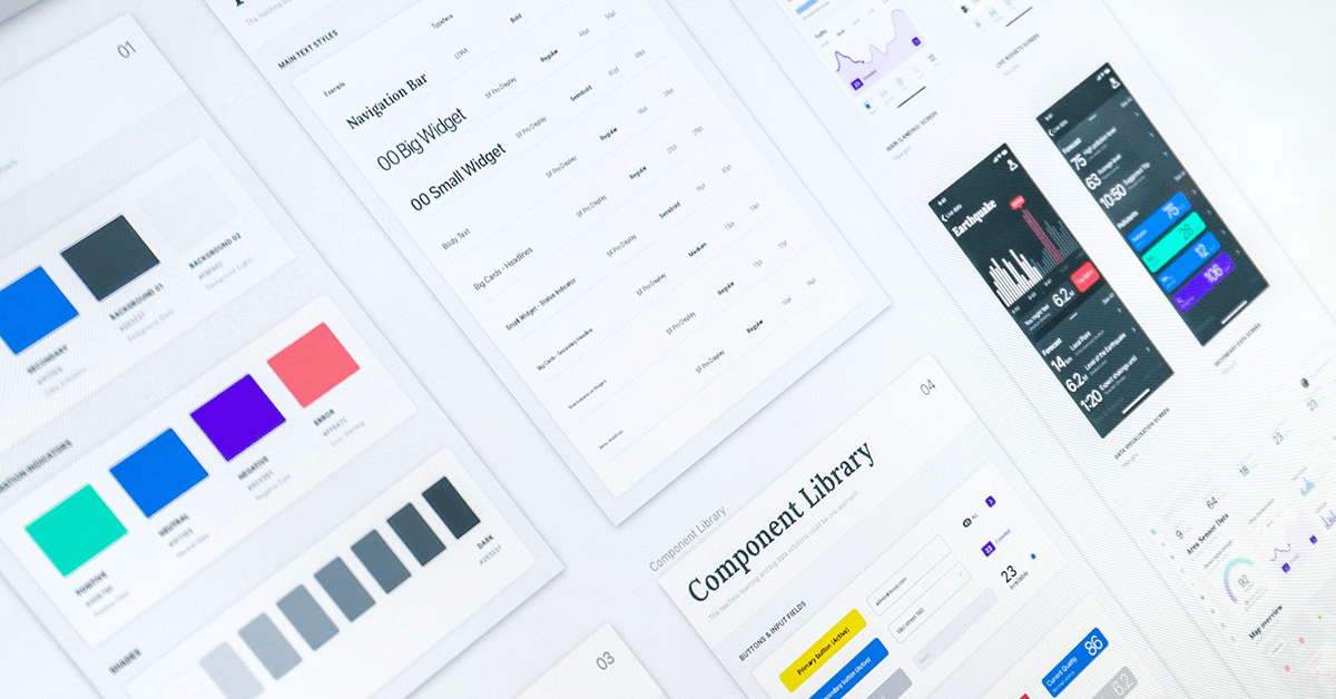
In Figma, design systems help teams organize their foundations, components, and patterns. Foundations include core elements such as colors, typography, and spacing, which define the overall look and feel of the system. Components are reusable design elements like buttons, form fields, and cards, each with pre-defined states and styles. Patterns are combinations of components that create common interface elements such as navigation menus and modals. By structuring these elements properly, teams can streamline their workflows and improve efficiency.
Key Advantages of a Design System
One of the most significant benefits of a design system is maintaining consistency across teams. When every product team uses the same system, the overall design remains uniform, reducing the need for constant revisions. For example, instead of each team designing their own button styles, they can all pull from a shared component library, ensuring that every button looks and behaves the same way across products.
Another major advantage is the speed of prototyping. With a design system in place, designers can quickly assemble high-fidelity prototypes using pre-built components. Instead of creating layouts from scratch, they can drag and drop elements into place, making it easier to present ideas to stakeholders. This approach allows for faster feedback loops and ensures that designs align with existing guidelines.
Scalability is another critical factor. As teams grow and products evolve, a design system makes it easier to expand and maintain designs over time. With a structured system, adding new features or updating styles becomes a seamless process rather than a complete redesign. Teams can also push live updates to the component library, ensuring that all designs stay up to date without requiring manual adjustments.
Unlike traditional UI style guides, design systems are functional and applicable. They do not just define how elements should look. They also provide guidance on how they should be used. For instance, a button component might include documentation on when to use it, best practices for placement, and accessibility considerations. This structured approach prevents inconsistencies and ensures that every component serves its intended purpose.
Another essential aspect of a design system is establishing a shared language between design and code. Design systems are not just for designers. They also impact development teams. If naming conventions in Figma do not align with the codebase, it can cause confusion and slow down implementation. Ensuring that components in design match their coded counterparts helps streamline the development process and reduce errors.
The Importance of Naming Conventions
Naming conventions play a crucial role in a design system. Without clear and consistent names, teams can easily become confused about which components to use and how they should function. For example, a primary button in Figma should have the same name in code. If one team refers to it differently while another calls it “Primary Button,” misalignment can occur, leading to inconsistent implementation.
A structured approach to naming helps teams organize their components effectively. Components are typically broken down into different levels, such as category, type, variant, state, size, and platform. For instance, a button component might be labeled as:
Button / Primary / Default / Medium / Web
By following a standardized format, teams can quickly identify and use the correct components. This also helps when documenting design system guidelines, as designers and developers can reference the same naming conventions.
Different organizations use different terms for their components. For example, some companies call a transparent button a “ghost button,” while others might refer to it as a “text button” or “chromeless button.” There is no single right way to name components. It depends on what works best for the team. The key is to establish a system that makes sense to everyone and is documented clearly to prevent confusion.
Who Contributes to a Design System?
A design system is a collaborative effort that involves multiple teams across an organization. Designers, developers, product managers, content strategists, and even brand specialists all play a role in shaping and maintaining the system.
Designers, including UX and UI designers, are responsible for defining the visual language, creating components, and ensuring that the system remains consistent. They work closely with developers to ensure that the components in Figma match the coded versions used in production.
Developers, particularly front-end engineers, implement components and ensure they function correctly in the codebase. They help maintain the component library and ensure that updates are reflected accurately in development environments. Accessibility specialists also contribute by ensuring that all UI elements meet WCAG standards and provide a good user experience for everyone.
Product managers oversee the roadmap and priorities of the design system. They ensure that business objectives align with design and development efforts, helping to define long-term goals and strategies.
Other contributors include content designers, who write documentation and establish clear guidelines for component usage, and quality assurance specialists, who test components for usability and consistency. Brand specialists ensure that the design system aligns with company branding guidelines, while researchers gather user feedback to refine and improve the system.
While most design systems are managed by a dedicated design system team, contributions often come from multiple sources. In organizations with a strong collaborative culture, product teams may suggest new components or improvements based on their specific needs. External agencies or consultants might also provide expertise when scaling a design system for a larger organization.
Scaling a Design System for Different Team Sizes
The structure of a design system varies depending on team size. Smaller teams often have a single designer managing the system, making it easier to maintain but requiring a well-structured approach. In medium-sized teams, maintaining the system becomes more complex, as multiple designers and developers need to contribute while ensuring alignment.
Larger organizations typically have dedicated design system teams responsible for managing and evolving the system. In these cases, multiple teams may use the system across different products, making clear documentation and governance essential. Large companies often work across multiple systems that serve different products, requiring careful planning to avoid fragmentation.
A common misconception is that large teams need entirely separate design systems for different products. In reality, a well-structured design system can scale across multiple teams, ensuring consistency without requiring duplication. The key is to establish clear communication and documentation so that teams understand how to adopt and use the system effectively.
Final Thought
A well-designed system is more than just a collection of UI elements. It is a foundation for consistency, efficiency, and collaboration. Whether working with a small or large team, having a structured approach to design systems makes it easier to build scalable and maintainable products.
If you’d like to discuss this topic further or explore how I can help you build one for your project or your team, feel free to reach out at hello@anitachang.com. I’d love to hear from you!